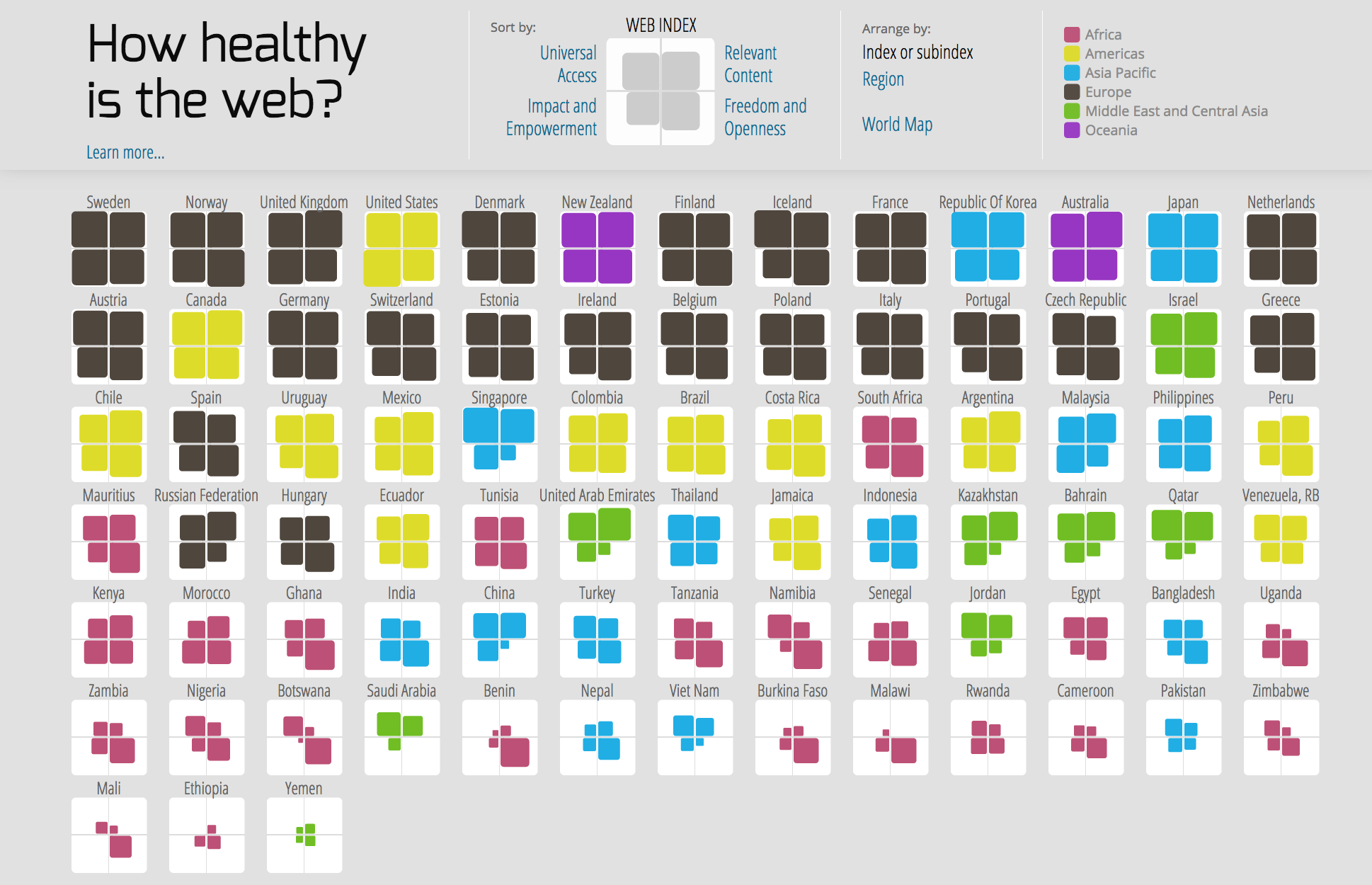
The Web index is a measure of the Web's growth, utility and impact around the world. It has been designed and produced by the World Wide Web Foundation.
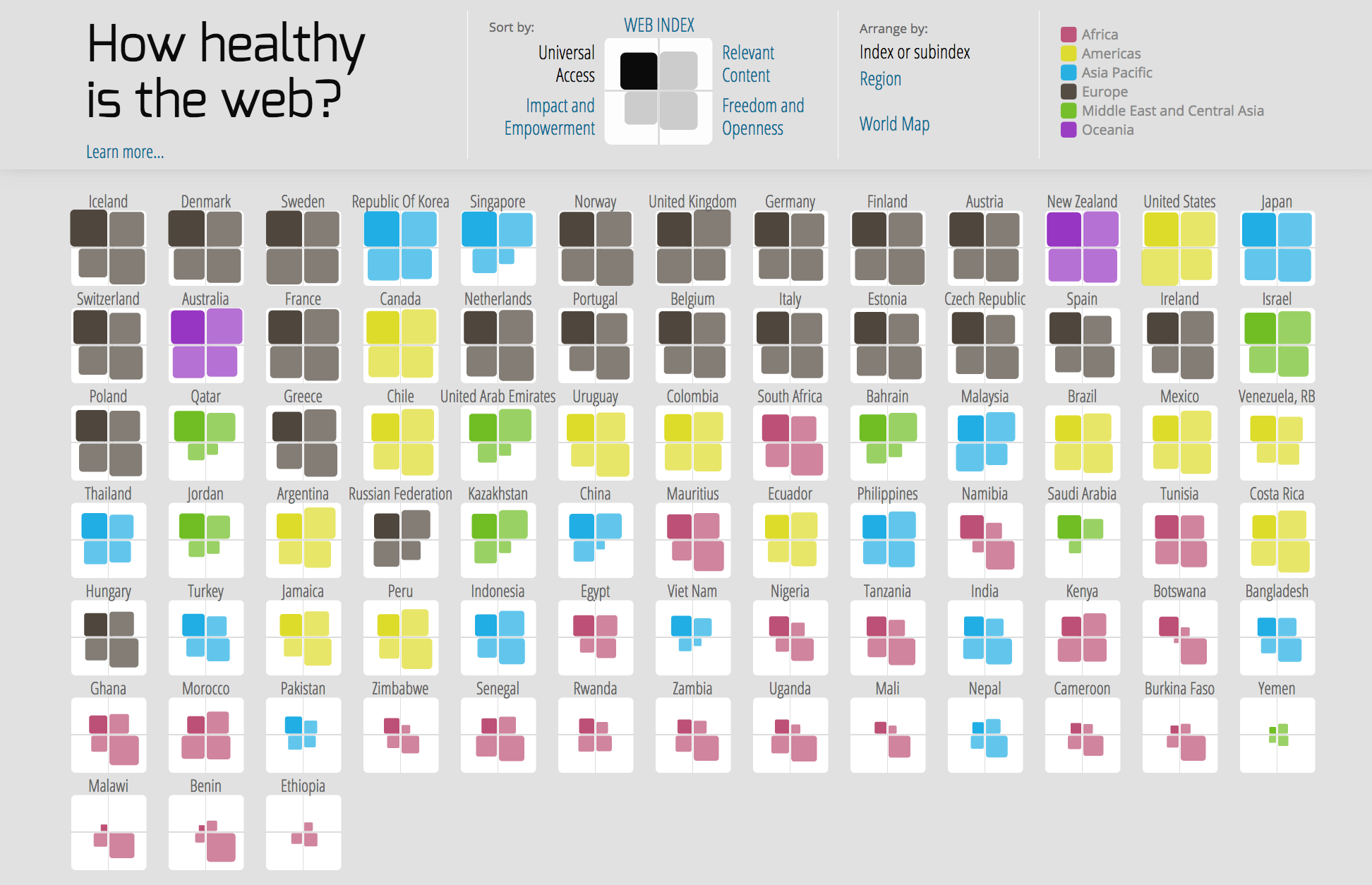
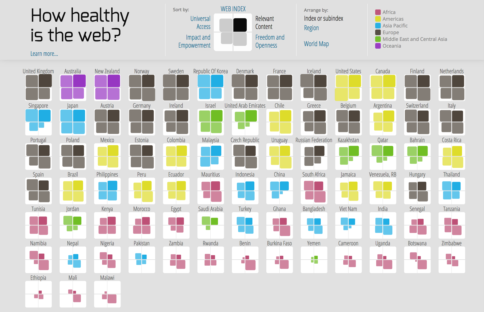
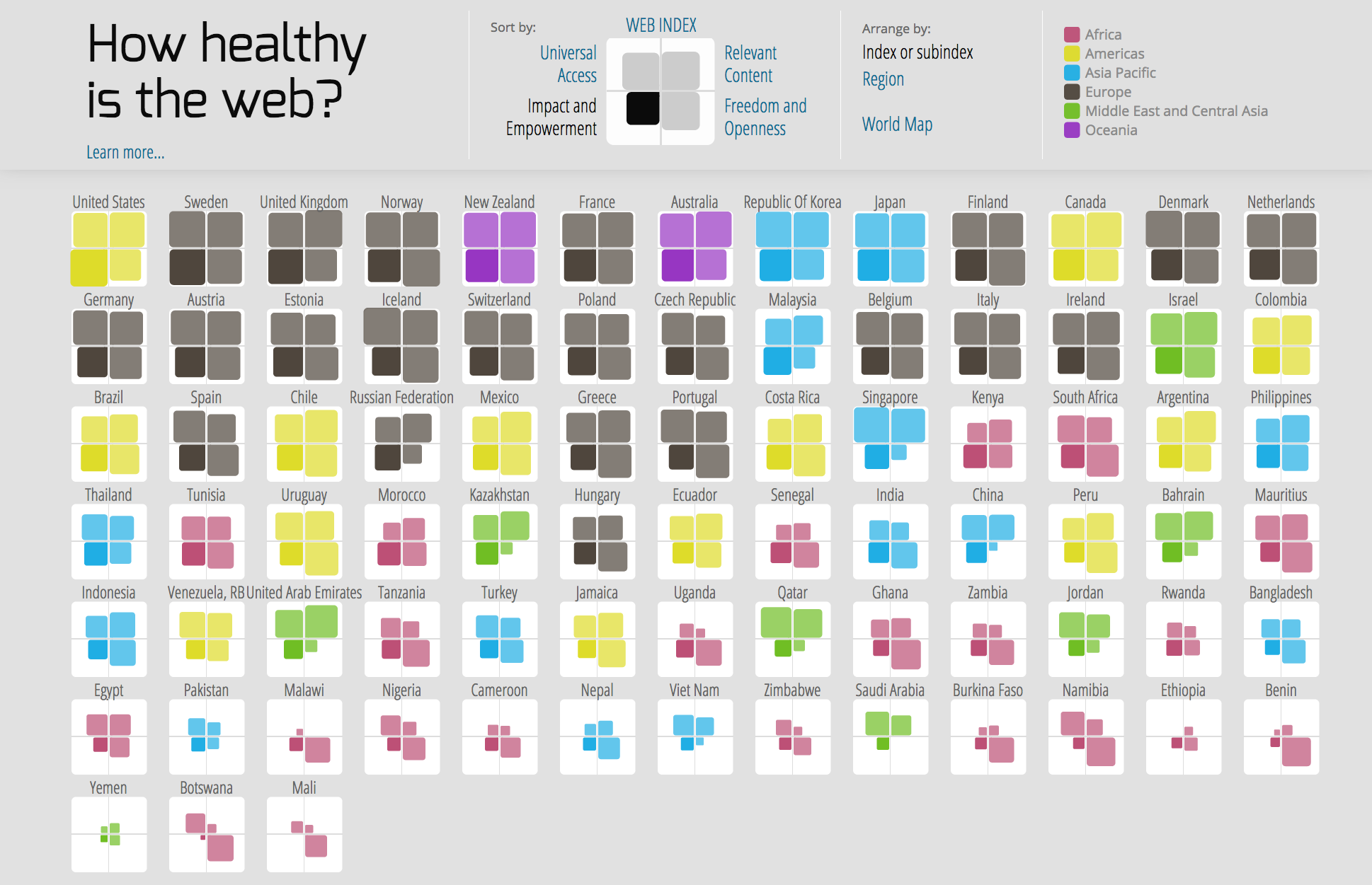
"How healthy is the web?" is an interactive visualisation which allows exploring the different components of the web index in the different countries. Each country is represented by an icon divided into four squares, each of which gives a measure to the following subindexes:
- Universal Access
- Relevant Content
- Freedom and Openness
- Impact and Empowerment
Year: 2014
Activities: concept, design and development
Client: self-initiated project
Featured at: Book: Data visualization for success, Interviews with 40 experienced designers (edited by Steven Braun)
Award: The project was an entry for the “Visualizing the impact of the World Wide Web challenge” organized by Visualizing.org (former data visualization community platform) and has received a honorary mention.
Technologies used: HTML5, JavaScript, D3.js
Different layouts
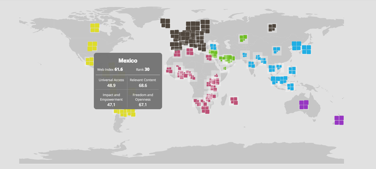
Geographic layout

Sorted icons displayed by country region
